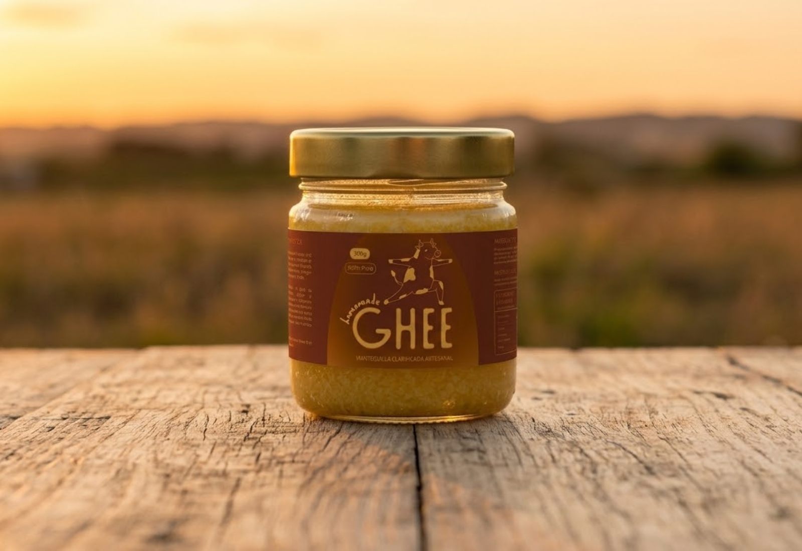
Branding
2026
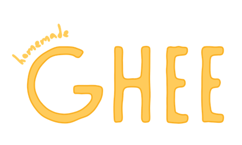
A branding and design project translating Ayurvedic wisdom into an everyday, honest, and aesthetically friendly experience.
Branding
2026
A branding and design project translating Ayurvedic wisdom into an everyday, honest, and aesthetically friendly experience.
Concept
I make my own ghee, and one day, waiting for a delayed flight, the idea hit me: why not give it a brand?
I wanted something fun and colorful — a clear departure from existing ghee brands — that could communicate the benefits of this food within Ayurveda, a tradition thousands of years old.
I liked the idea of weaving small facts about this practice into the product itself, so I could gift it to people I love and they'd understand it's more than just something healthy.
I wanted the design to feel just as intentional: vibrant colors, balanced with contrast.
Logotype
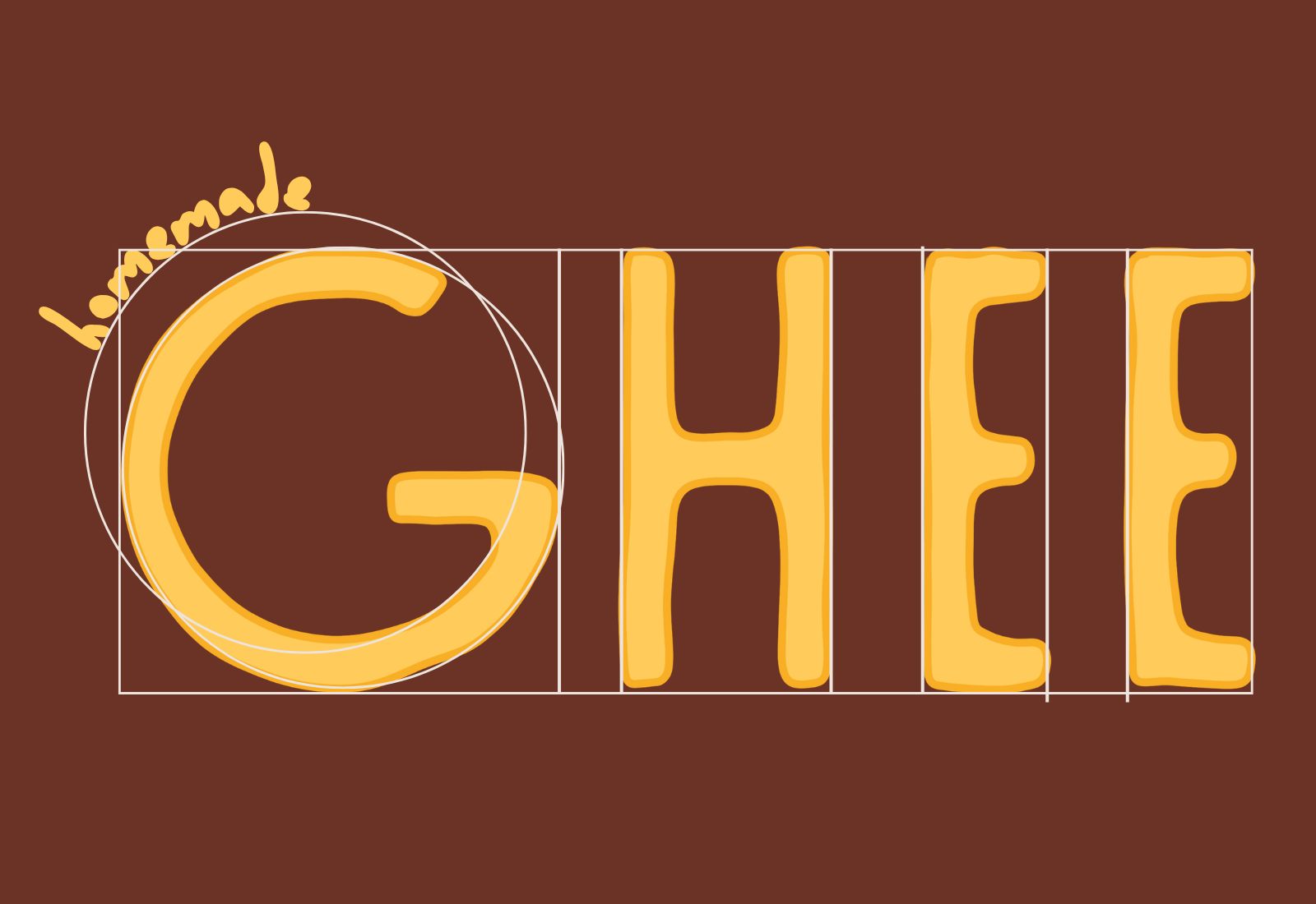
Grid
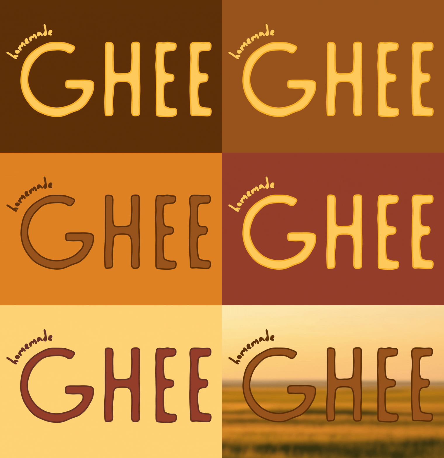
Color variations
Isotype
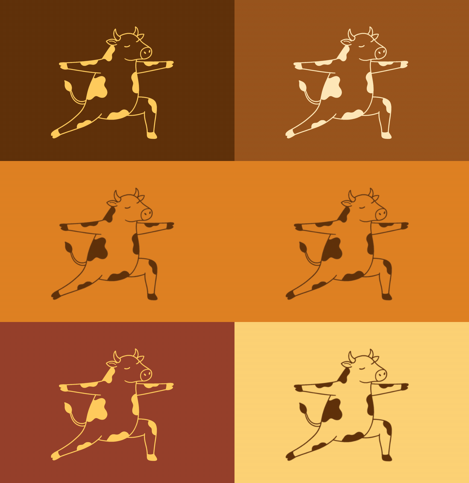
Color variations
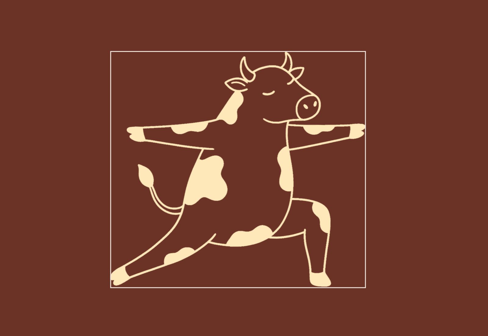
Grid
La paleta se compone de una armonía análoga cálida que transita de forma fluida por un segmento continuo del círculo cromático. Al estar inspirada en los elementos de la naturaleza, convive de manera armónica y a la vez contrastante.
Typography I
SK Moralist
Aa Bb Cc Dd Ee Ff Gg Hh Ii Jj
Kk Ll Mm Nn Oo Pp Qq Rr Ss Tt
Uu Vv Ww Xx Yy Zz
Typography II
Questrial
Aa Bb Cc Dd Ee Ff Gg Hh Ii Jj
Kk Ll Mm Nn Oo Pp Qq Rr Ss Tt
Uu Vv Ww Xx Yy Zz
0123456789&!$*
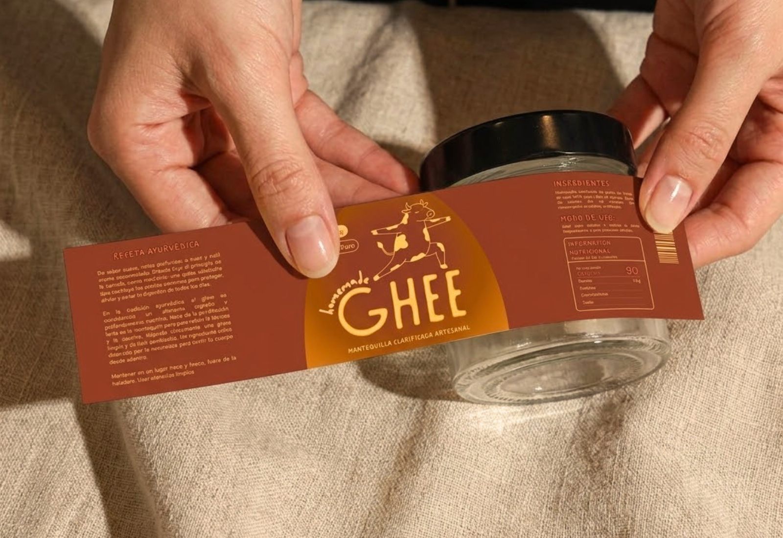
Packaging